Showing posts with label inspiration. Show all posts

July 29, 2014

SENSE OF COLOUR


Finally got to Vogue House - something that was on my London to-do-list - and after my meeting, I found myself on a sporadic voyage, before long, finding the Yohji Yamamoto store as well as the Hauser & Writh gallery displaying a fascinating colour show by Richard Jackson - exhibition closed July 26th. 


What fascinates me often the most, with many artist’s work is the use of colour. 

"When I was doing painting as a freshman in university, an older female student came and told me that I severely lacked a sense of colour," says Murakami in a 2013 interview with CNN: I guess that's what it is with me too, I don't understand colour, so seeing psychedelic colour palettes being used by artists such as Murakami is beyond fascinating.

It's a cutesy little stroll around the naturally bare and greyish space but nonetheless provocative. Paint filled tubes are melded into words - something like the LED open sign you'd find in the red light district. Meanwhile five coloured men appear to have these paint tubes entering the mouths and leaving through their rear end. The exhibition could be described as something like commentary on consumerism and the digital age - there was a mannequin making black photocopies of her punani, coloured shredded paper in a pile on the other side of her. Don't forget the clown with tits for eyes. This is so cool. I still lack a sense of colour.

Mushroom Painting #2, Takashi Murakami, 2000 Christie's New York Nov 2002


July 06, 2014

WORN TO A FESTIVAL


In my mind festival wear is so often bohemian and flowy shit etc but that doesn't feel right. This outfit is a combination of comfort, necessity and nudity: my slut-free summer mission has been aborted.

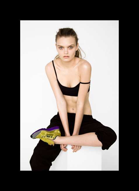
I'm wearing DIY shorts made from scuba-esque fabric which is literally to die for, it will appear in many more posts. This is a Nike dri-fit sports bra, I actually picked it up from an outlet but it's amazing. The baseball shirt was from my brothers wardrobe, you can get one on eBay or official shirts like mine here. All worn with some old Nikes.

Inspiration board features Mathieu Missiaen +Henri Matisse 'The Flowing Hair'.

June 12, 2014

PASTEL SEXY

In my artsy days, I loved working with colour pastels. It was so easy to blend colours and create images in seconds - not literally, that shit took time. They were like the step-up from colouring pencils, but they were the step-up, adding texture to images was a breeze: I can't tell you how many flowers I coloured. But then there was the irritating smudge... Your hand is resting in that area with blue blended into dark green, you move your hand upwards and suddenly the area where the pink and the white and turquoise is, is ruined. Fuck you pastels: I know it was my fault, but still, fuck you... No, I still haven't learnt my lesson.

There has always been something alluring about pastel colours. Something demure and understated that was also distinctly noticeable and always evoked a similar sort of feeling. And now it's everywhere, so we'll discuss.

Ingvild Abrahamsen

I spent a few hours gawping at this design, probably because it ticked all the fabric lustlist boxes that made me enter my computer screen and feeeel this beauty. This is the kind of grown up use of pastels that is so big-kid friendly that little-kids have to love it too. We're presented with an emphatically homme friendly silhouette in beige tones and powder blue. Don't forget the dolphins giving the black a dose of life and reminding me that I still haven't swam with dolphins... I was actually spurred to write this post by an email from ASOS about the Ariel Sweatshirt, isn't it darling...


This is the part where I explain to you how much more I love menswear because no matter how boring or basic or exciting it is, it will always have the air of the revolutionary, men and fashion? Computer says no. I'm talking shit now.

Shaun Samson

I really liked the Shaun Samson swag. I imagined a hoodlum rolling around in pink and I realised this must all be the influence of Cam'ron. The organza and glitter suggests a delicateness that's juxtaposed by the tailored shapes, I mean these are essentially super fancy dress shirts. (Speaking of glitter, my RihRih rant is on my Tumblr, it comes from a good place in my heart.) 

June 11, 2014

UNIFORM

Can you imagine being out in the middle of a turquoise ocean stuck on a float... A pastel coloured float, that keeps on bobbing despite the fact that these little movements, beyond your control, are scaring the fuck out of you - Lord knows how deep the water is down there. This blog is basically me finding my sea legs and since my last post to date, I have been so blankly uninspired that my uniform has been dictated by mythical pastel colours, none of which live in my wardrobe - except from like two beige tops, everything is black.

It is a massive struggle to transition from season to season. Every year after growing accustomed to the winter - AW13 seemed incredibly long in the UK - the summer arrives. I hold back from saying I hate it, but until I can redefine the boundaries of my wardrobe and get botox in every part of my body to stop sweating, I hate summer. Summer in the UK seems odd, especially in London where the "stand on the right" sign is adopted as the holiest of TFL rules and the raucous behaviour of passengers will attest to this. 

So this is usually the point where I go shopping, or tell you all the great things I bought, or show you pictures, but I am finding the consumption of fashion rather bland and this, quite simply, could be the result of the epic influence of Family Guy on my world perceptions. Sometimes I wish to refer to all clothes as different uniforms and although this almost defies the entire concept of fashion, especially as a means through which one can express oneself, but the word uniform is essentially an appropriate description.

The McStroke episode (season8episode6) features Stewie Griffin tryna be cool describing a situation all too familiar to kids on the internet -
"so I'm shavin' last night at this make out party. I took a bunch of pictures. You can see  'em on my MySpace page, along with my favourite songs and movies and things that other people have created but that I use to express my individualism." For arguments sake the word MySpace could be substituted for every blogging platform on the internet, but well, that's another story...

We can debate the democratisation of fashion and dispute the fact that it was terrible because now there's like a few million more kids who name drop designers whose shows they've never attended and whose Creative Directors they don't recall, but that is only defying the definition of fashion, fashion as a huge scope of things has always been defined by the public and to quote Game of Thrones, "the power resides where men think it resides".

My blogging absence has mainly been due to the fact that we have arrived in fashions upcycling of trends, to the early 2000s and quite frankly, I was alive and fully aware of my existence so this is a pretty shit season. Somehow not gripped by the epic poolslides that Phoebe Philo and Jonathan Saunders, among others bombarded us with, this season is full of colour. The highstreets have interpreted this with through the usual ,printed pieces in complementary colours, now styled with sweeper coats and strappy camisoles: haven't you seen that before?


And then, there's my uniform. Feel free to criticise my lack of originality but the black, the blue and the white are and shall be all I will wear until maybe we get back to winter and turtlenecks can be my bff again. Ebay mules, 

Bowen Aricó

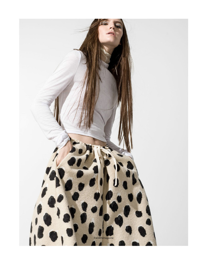
Bowen Aricó's work in Oyster Magazine (feat Marthe Wiggers and Nike Gyakosou) amplifies the sports bra lust life - no t-shirts, just sports bras and cropped pants. While his work for Friend the Magazine (feat Sophie Hirschfelder) features summer's perfect lightweight cotton, the bottoms make me think of Comme Des Garçons polka tees versus catwalk Comme Des Garçons which I found channelled through maybe the most epic skirt I've ever owned at COS. The sense of dynamism Aricó portrays in a studio setting is fascinating, maybe brought to life by the model's gaze and pose or faux motion in the hair. It's cool anyway.

James Robjant

This season's denim however is knocking my socks off! Levi's at LN-CC balance the perfect silhouette, length and taper that makes me wish I had £500 to splurge on jeans. Aside from this navy everything (t-shirts especially) are *equalssign* wardrobe staple. Did I mention raw edges? Hemming is almost always the last part of the production of a fashion item, by which stage, I am admittedly too lazy and too irritated - having pricked myself with sewing needles - to hem most (if not all) of my product. So yes, raw edges are life. James Robjant's feature in Used Magazine with styling by Luke Raymond (models Josh Wicks and Maddy Elmer) embodies the aforementioned characteristics. I'm thinking of that denim COS dress and Acne Studios totes in her dress straps.

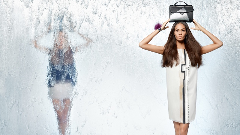
It would totally be a sin not to mention Céline... The AW14 lookbook had me drooling at first sight, not just because of the fur and the MAC Sin-esque looking lipstick but because of the way those pleats fall imitating a liquids flow and then the blue lines that accentuate the symmetry and asymmetry. I know the season isn't even here yet, but this is channelled in &Other Stories' sweatshirt and t-shirt combo, I wish they had matching pants though. (Also, how did Céline manage to successfully imitate the Air Force 1 design, I swear that must be patented?!? Either way, that is not allowed, you can't do that, no-one cares if you're Céline, the designers should have enough flare and creativity not to have to mimic a leading sports apparel brand. Same goes for you Karl Lagerfeld, stop it.

I digress. Still on that pastel pool float, bobbing around in the ocean.


April 18, 2014

POP READING


I only bought this issue of -pussy-POP because it had my favourite word emblazoned on the front: nothing like engaging language. And although I have zero interest in Pussy Riot, the mag content is as always, truly intriguing: complete with epic chocolate models - the perfect Smalls feature on the back #tactics -, surreal editorials and written content.


From a fully packed week long holiday to jumping straight back into the daily grind, I haven't had the time to go through all the content but what I have been able to grapple has been some deep shit. Magazine gold=yas.


March 17, 2014

EXECUTION SQUARES

The first week of March was spent interning at NME HQ. It was a great experience and the team there are quite simply human gold. Luckily 3 minutes walk from the magazine office was the Tate which I spent shitloads of time in. The above set of photographs were probably the most striking, consuming an entire wall and getting me super excited for my global voyage.
Execution Squares by Hrair Sarkissian

February 16, 2014

ANIME SHOES


FEBRUARY


In amongst being consumed by University interviews, portfolio preparation and the production of Short Films and whatever else to complete school, blogging has been the last thing on my list of shit to do. I will continue to share on every platform, namely my Tumblr has become more personal and Wanstead Station is inspiring life. In the meantime I will be indulging in my chocolate birthday cake.


November 01, 2013

AFTER 2000


With all this fucking 90s nostalgia, all I can think of, is how great the 90s were: this is so ironic considering, the oldest I was in the 90s was 4 and even then, I only have memories of my mum in levis when her tiny leather backpack getting stolen from her in Rathbone Market. To say the least, the 90s didn't really define me personally which makes me question this resurgence.

Interning at TimeOut, I came across some old issues of the revolutionary i-D magazine. Oddly à la mode androgynous content, lots of nudity (courtesy of advertorials and i-D's own fashion photography), rough art and the raw qualities of 90s fashion.

Then we get to 2000. I picked up three issues - April, May and June 1999.  But then we get to 2000. The front cover is hi-res and vibrant, it has an age-d quality to it featuring Gisele Bundchen and the content is borderline timeless as the photography in the issue could easily slide into a 2013 copy of i-D.

I felt a rebellious spirit fade and instead, be replaced by a spirit of sexual maturity, "grow up you slags" - type thing.

Earlier editions of i-D made Yohji Yamamoto,  and Helmut Lang "finest cotton armbags since 1997", seem approachable, et pour chacun. Calvin Klein looked like great underwear on a girl getting undressed... Chanel pumps, Christian Louboutin heels and Prada sandals, looked approachable, shot on the rooftop of a 'Universal House' the home of a 45 year old listing magazine, alongside Facteur Celeste and YMC (crazy feet sandals). It's like a division occurred after 2000.

What's next?

October 17, 2013

Multicursor - Working In Background